Why Good Design Sometimes Looks Simple
Simple design is often misunderstood because the finished object hides most of the decisions that produced it. When something feels clean, balanced, and easy to use, it can appear as though very little had to be done. In practice, that sense of ease usually comes after a long process of deciding what matters, what can be removed, and what deserves more attention precisely because there are fewer elements competing for it.
This distinction matters because simplicity and simplification are not the same thing. Simplification can mean reducing a product until it looks cleaner. Simplicity, when it is done well, comes from understanding the product deeply enough to know what can disappear without weakening the experience.
That difference becomes especially clear in products people use every day. A chair can look beautifully restrained and still become uncomfortable after half an hour. A workspace can be visually perfect and still suffer from poor lighting, weak ventilation, or distracting acoustics. A device can appear advanced because it has more controls and visible technology, while actually asking too much of the person using it.
The most successful design rarely depends on how much it can show. It depends on how little friction it creates.
Simplicity usually begins with function
Minimalism is often discussed as a visual language: fewer colors, fewer materials, cleaner geometry, less decoration. Those things can certainly be part of it, but they are not what make a product genuinely simple.
A more useful starting point is function.
What does the person need from the product? What happens during normal use? Where does discomfort appear? Which decisions should the user have to make, and which ones should already have been solved by the design?
Once those questions are answered properly, visual restraint often follows on its own.
This is particularly true in workspace design, where the quality of the experience depends on many things that are not immediately visible. Airflow, sound, ergonomics, lighting, temperature, privacy, proportions, materials, and technology all affect whether a space feels comfortable after five minutes or after forty.
The challenge is that none of these systems should compete for attention. They should simply work together.
The best technical decisions are often the least visible
A product can contain a great deal of engineering without feeling complicated to use.
Ventilation is a good example. Most people do not want to think about airflow rates, fan control, or operating modes when they enter a workspace. They notice only whether the air feels fresh and whether the system is quiet enough to ignore.
Lighting works in much the same way. The technical questions may involve brightness, angle, color temperature, glare, and camera visibility, but the user should not have to manage those variables every time they sit down for a call.
Acoustics are similar again. Sound insulation, reverberation, speech intelligibility, and internal absorption are technical subjects, yet the person inside the space experiences them in much simpler terms: whether the room feels calm, whether the conversation feels private, and whether speech sounds natural.
When these systems are resolved properly, the complexity remains in the product rather than being transferred to the user.
That is one of the reasons good design can look deceptively simple. The difficult work is still there; it has simply become less visible.
Why restraint is harder than addition
Adding features is easy to notice. A new control, another material, an extra surface detail, or a visible technological element can all make a product appear more sophisticated.
The problem is that every addition creates another relationship that has to be managed. It can make the product harder to manufacture, harder to maintain, harder to understand, or simply more visually restless.
Removing something requires more confidence, because there is less left to hide behind.
Once decoration is reduced, proportions matter more. Materials matter more. Gaps, edges, joins, finishes, and tactile details become easier to notice. A restrained object gives each decision more weight.
This is why simple products are not necessarily easier to design. In many cases, they are less forgiving.
Minimalism only works when comfort survives it
The most obvious failure of minimalist design happens when the visual idea becomes more important than the person using the product.
A thinner seat may create a cleaner silhouette but provide less support. A smaller ventilation opening may preserve a perfect surface while reducing comfort. Removing controls may simplify the appearance while making the product less intuitive.
At that point, minimalism has stopped being useful.
There is no value in making a product visually quieter if the user has to compensate for the decision later.
For a workspace, this means that there still has to be enough room, enough air, enough light, enough acoustic treatment, and enough ergonomic support. The design can be restrained, but the experience should never feel reduced.
Materials become more important when there is less decoration
Minimal design also changes the role of materials.
When there are fewer decorative elements, the surface itself becomes more expressive. Texture, warmth, weight, durability, and the way a material ages begin to matter more.
This often leads to a different kind of design thinking. Instead of asking which finish creates the strongest immediate impression, the question becomes whether the material feels appropriate, whether it will remain relevant over time, whether it can be maintained, and whether it supports the intended use of the product.
That is also why responsible material choices fit naturally into restrained design. Products that are intended to last, move between spaces, be repaired, or remain visually relevant for years usually benefit from materials chosen for more than appearance alone.
Technology does not need to advertise itself
The same principle applies to workplace technology.
A product does not become smarter simply because its technology is more visible. In many cases, the opposite is more useful.
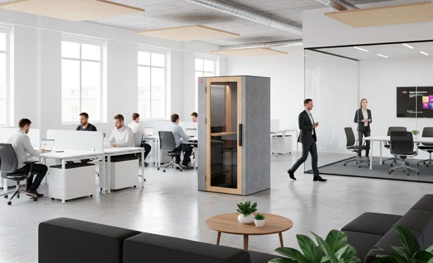
People want a space to be available when they need it. They want the lighting to work, the air to feel comfortable, the power to be where they expect it, and booking to fit into the systems they already use.
When those things happen without extra effort, technology becomes part of the environment rather than another task.
That is a more demanding design problem than simply adding features, because the product has to anticipate what the user needs while remaining easy to understand.
Designing from the inside out
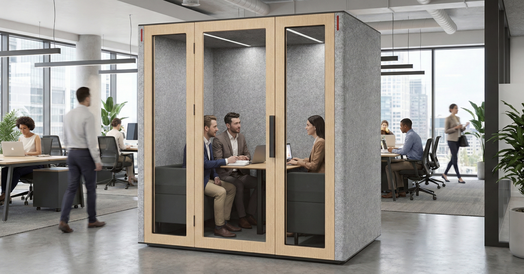
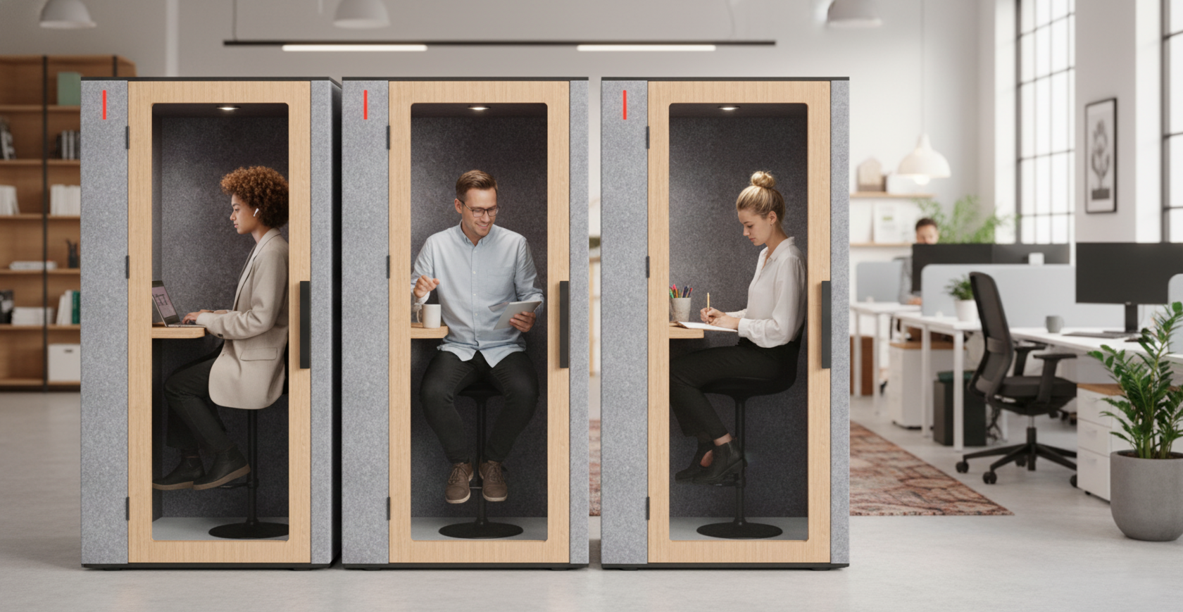
At WorkBooth, this is why the design process starts with the person inside the booth rather than with the exterior appearance.
The first questions are about comfort and use: how the air moves, how the light behaves during a video call, how sound feels inside the space, how the proportions support different tasks, and how easily someone can enter and begin working.
The exterior develops from those decisions.
Its simplicity is therefore not the starting objective. It is the visible result of a process that gives priority to what the person experiences during everyday use.
That approach also explains why the product does not need to rely on visual complexity. If the underlying systems work properly, the design can remain calm.
Simplicity comes later
A simple-looking product is easy to copy at the surface level. Clean lines, limited colors, restrained materials, and minimal detailing can all be reproduced as a style.
What is much harder to reproduce is the process behind them.
Real simplicity comes after the problem has been understood, the technical compromises have been resolved, unnecessary elements have been removed, and the remaining details have been refined enough that the user no longer has to think about them.
That is why good design often looks simple only at the end.
The simplicity is not evidence that little work was required. It is evidence that the work has already been done.